

Exchange Homepage Redesign
The Exchange Enterprise Platform | Capital One | 2024
Background
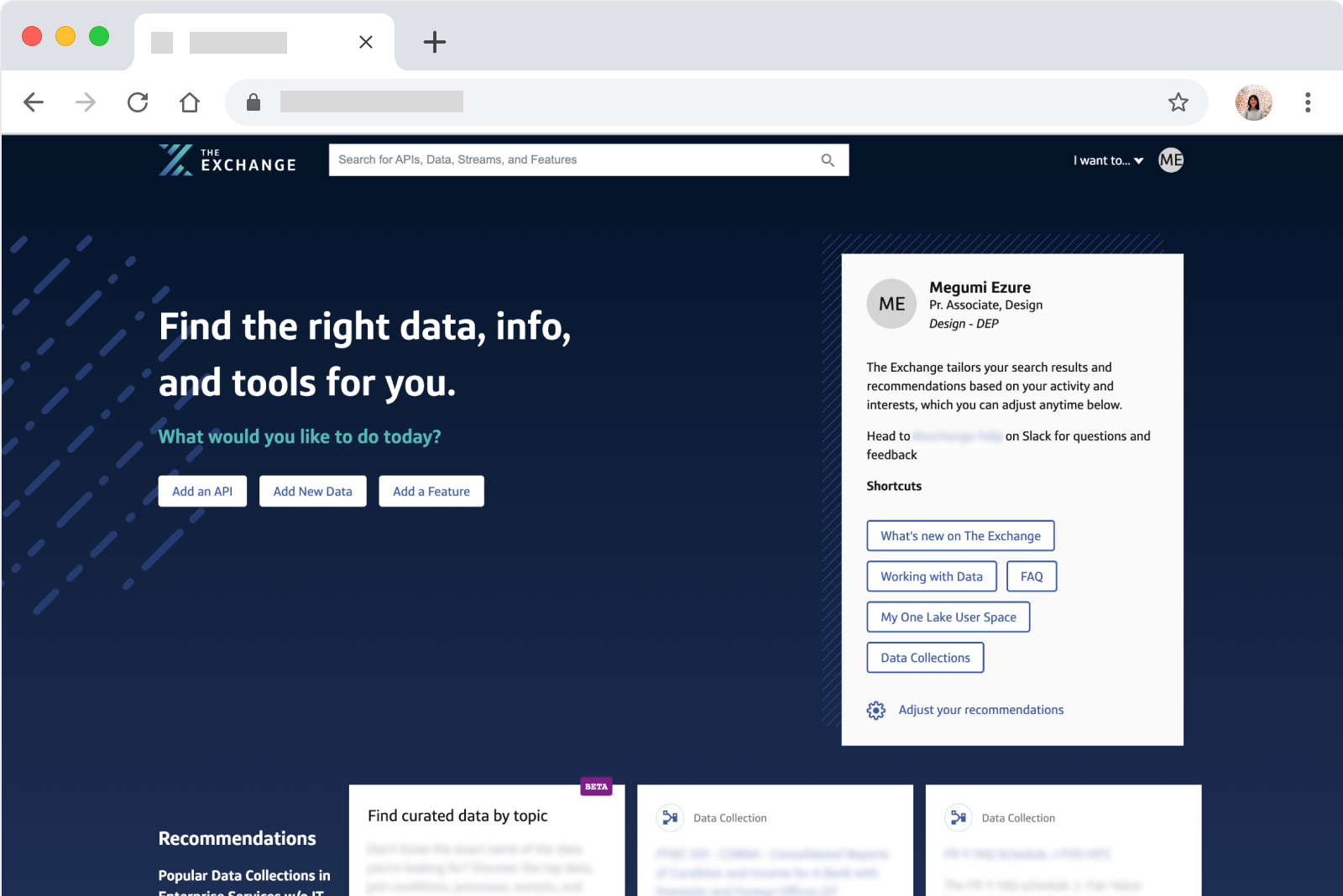
The Exchange platform had an outdated homepage with only a limited functionality. The platform had grown over the years and its features and functionalities had increased exponentially. Need for change was obvious, but since the existing homepage was inscalable, This meant that our users had more and more tasks to handle on The Exchange and desperately needed help to be as productive as possible. The current homepage design, however, could not scale to this growth and it has now become underutilized.
How might we redesign the homepage so that it becomes a helpful part of their daily workflow and increase their productivity?
Design Problem & Direction
Based on our user feedback over the years, the design team underlined two problems:
- The platform has so many pages and functionalities that it’s hard to access the relevant ones without bookmarking. (Need for intuitive navigation)
- The platform homepage is not surfacing enough useful functions and information for our users to help with their daily tasks. (Need for better homepage content)
After much deligation, I took on the design lead to solve the problem #2.
Technical Limitation
Based on our user feedback over the years, the design team underlined two problems:
- The platform has so many pages and functionalities that it’s hard to access the relevant ones without bookmarking. (Need for intuitive navigation)
- The platform homepage is not surfacing enough useful functions and information for our users to help with their daily tasks. (Need for better homepage content)
After much deligation, I took on the design lead to solve the problem #2.
Solution
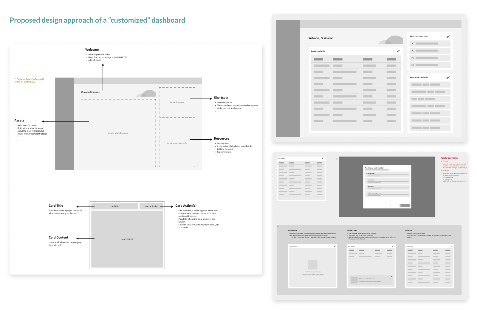
My ultimate solution was customization. If our backend can’t automatically suggest things, let our users be in control and let them decide what’s useful enough to keep on their own homepage. Perhaps, we can learn from those data points now and eventually make our system smarter in the future, using AI.
My approach of scalable design was well received by all of the design leadership and partners at the time. The next step would be to polish the wireframes for research to validate the design direction.
Learnings
With an impactful project such as this one, combined with frequent leadership changes, it caused more and more people wanting to be involved. This caused the classic problem of too many cooks in the kitchen, with competing directions from leadership.
Although the project was paused, I gained a lot of soft skills in areas like project management and stakeholder management. Next time, I would suggest to keep the stakeholder number to a minimum in order to have proper alignment.

Exchange Homepage Redesign
The Exchange Enterprise Platform | Capital One | 2024
Background
The Exchange platform had an outdated homepage with only a limited functionality. The platform had grown over the years and its features and functionalities had increased exponentially. Need for change was obvious, but since the existing homepage was inscalable, This meant that our users had more and more tasks to handle on The Exchange and desperately needed help to be as productive as possible. The current homepage design, however, could not scale to this growth and it has now become underutilized.
How might we redesign the homepage so that it becomes a helpful part of their daily workflow and increase their productivity?
Design Problem & Direction
Based on our user feedback over the years, the design team underlined two problems:
- The platform has so many pages and functionalities that it’s hard to access the relevant ones without bookmarking. (Need for intuitive navigation)
- The platform homepage is not surfacing enough useful functions and information for our users to help with their daily tasks. (Need for better homepage content)
After much deligation, I took on the design lead to solve the problem #2.
Technical Limitation
Based on our user feedback over the years, the design team underlined two problems:
- The platform has so many pages and functionalities that it’s hard to access the relevant ones without bookmarking. (Need for intuitive navigation)
- The platform homepage is not surfacing enough useful functions and information for our users to help with their daily tasks. (Need for better homepage content)
After much deligation, I took on the design lead to solve the problem #2.
Solution
My ultimate solution was customization. If our backend can’t automatically suggest things, let our users be in control and let them decide what’s useful enough to keep on their own homepage. Perhaps, we can learn from those data points now and eventually make our system smarter in the future, using AI.
My approach of scalable design was well received by all of the design leadership and partners at the time. The next step would be to polish the wireframes for research to validate the design direction.
Learnings
With an impactful project such as this one, combined with frequent leadership changes, it caused more and more people wanting to be involved. This caused the classic problem of too many cooks in the kitchen, with competing directions from leadership.
Although the project was paused, I gained a lot of soft skills in areas like project management and stakeholder management. Next time, I would suggest to keep the stakeholder number to a minimum in order to have proper alignment.
Home
Work
Exchange Homepage Redesign
The Exchange Enterprise Platform | Capital One | 2024
Background
Despite the amazing growth of The Exchange platform, it had an outdated homepage with only a limited functionality. This left the homepage being underutilized by our users. -- How might we redesign the homepage so that it becomes a helpful part of their daily workflow and increase their productivity?
Design Problem & Direction
Based on our user feedback over the years, the design team underlined two problems:
- The platform has so many pages and functionalities that it’s hard to access the relevant ones without bookmarking. (Need for intuitive navigation)
- The platform homepage is not surfacing enough useful functions and information for our users to help with their daily tasks. (Need for better homepage content)
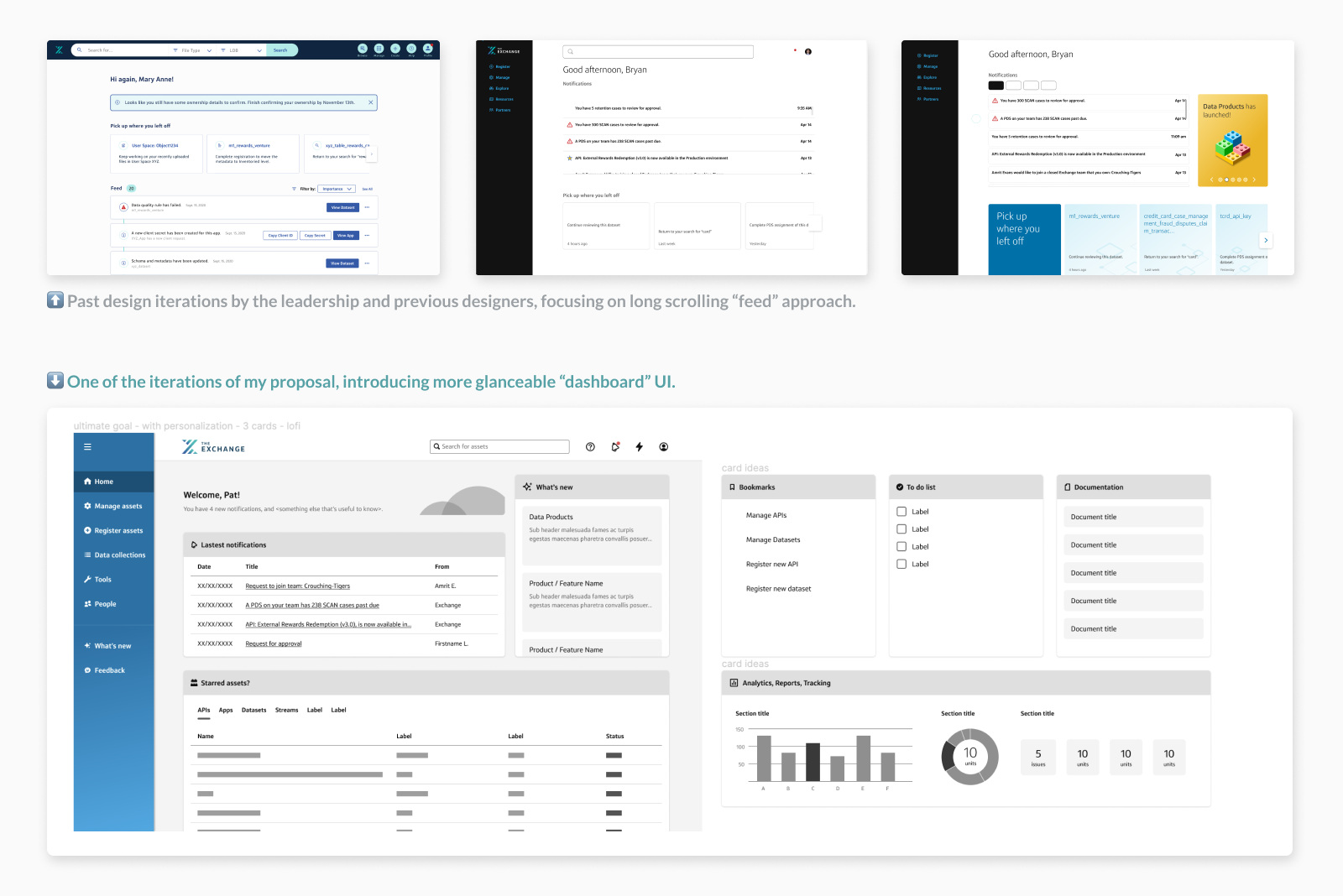
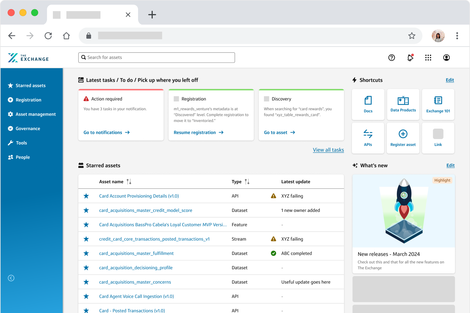
As I took on the Design Lead role to solve the problem #2, I proposed to introduce a dashboard-like homepage, where users can get a glance of what how things are going and easily view what actions they need to complete. This design direction easily received a green light, but we were presented with technical limitations.
Technical Limitation
Based on our past research documents and quotes, the most frequently requested features involved “smart” personalization. (Ex: pick up where you left off, notifications, show me info and actions relevant to me, etc.)
The major challenge here was that our backend could not achieve the level of personalization that our users were asking for. So, I needed to figure out a useful dashboard that we can ship with what we already have.
Solution
My ultimate solution was customization. If our backend can’t automatically suggest things, let our users be in control and let them decide what’s useful enough to keep on their own homepage. Perhaps, we can learn from those data points now and eventually make our system smarter in the future, using AI.
My approach of scalable design was well received by all of the design leadership and partners at the time. The next step would be to polish the wireframes for research to validate the design direction.
Learnings
With an impactful project such as this one, combined with frequent leadership changes, it caused more and more people wanting to be involved. This caused the classic problem of too many cooks in the kitchen, with competing directions from leadership.
Although the project was paused, I gained a lot of soft skills in areas like project management and stakeholder management. Next time, I would suggest to keep the stakeholder number to a minimum in order to have proper alignment.