

ConnecTalk
ConnecTalk app | SoftBank | 2018
Background
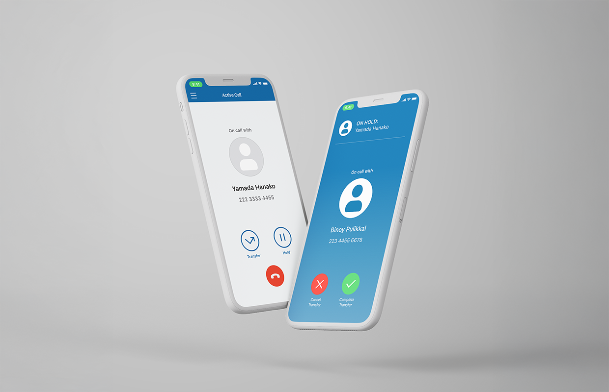
SoftBank is a large, multinational telecom company based in Japan. As the world is going more “mobile”, SoftBank felt encouraged to reduce the number of traditional desk phones and replace them with mobile apps. They asked Cisco/BroadSoft for a mobile communication app with our unique advanced call settings.
SoftBank had a client at the time who needed this app ASAP, so the plan was to deliver an interim version of the app first, with minimal features.
Challenges
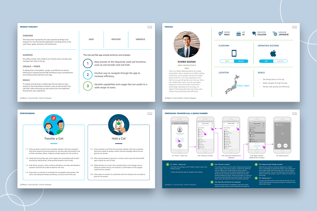
Following BroadSoft’s B2B process, we already had a baseline wireframes and deliverable formats. However, there were a couple of unique design challenges with this client:
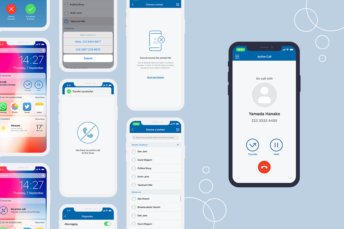
- With it being a partial release of the full app, this interim design needed to have a flexible UX foundation that can scale up and handle more functionalities later on.
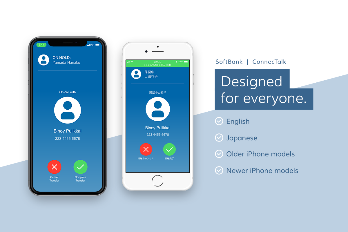
- Bilingual app. This app was to be released in both English and Japanese. We had to consider that Japanese involves “Kanji” characters that are visually more complex and dense than the English alphabets. We had to make sure that everything was legible and easy to navigate in both languages.
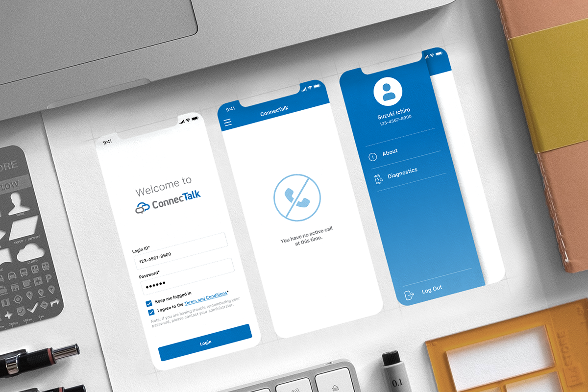
- Minimal branding. SoftBank provided us with a minimal branding for this app (only primary colors and a logo). They simply asked for a business/corporate look and feel. Without icons and other visuals, our design team had to define their look and feel on the go.
My role
As a design lead for this project, my main task was communication. With the multicultural team and clients (including Americans, Indians, and Japanese), each in different timezones, excellent communication skill was crucial to ensure that we were all on the same page.
In addition to defining UX flows and wireframes, I directed and mentored the UI team in India, with their production efforts and client communication.
Impact
This was a major contract for BroadSoft, right after being acquired by Cisco. It was a perfect project to prove the power of BroadWorks (BroadSoft’s telecomm backend system) and the capabilities of our design team. The interim phase was successfully delivered and launched with a highest customer sastisfaction rate.

ConnecTalk
ConnecTalk app | SoftBank | 2018
Background
SoftBank is a large, multinational telecom company based in Japan. As the world is going more “mobile”, SoftBank felt encouraged to reduce the number of traditional desk phones and replace them with mobile apps. They asked Cisco/BroadSoft for a mobile communication app with our unique advanced call settings.
SoftBank had a client at the time who needed this app ASAP, so the plan was to deliver an interim version of the app first, with minimal features.
Challenges
Following BroadSoft’s B2B process, we already had a baseline wireframes and deliverable formats. However, there were a couple of unique design challenges with this client:
- With it being a partial release of the full app, this interim design needed to have a flexible UX foundation that can scale up and handle more functionalities later on.
- Bilingual app. This app was to be released in both English and Japanese. We had to consider that Japanese involves “Kanji” characters that are visually more complex and dense than the English alphabets. We had to make sure that everything was legible and easy to navigate in both languages.
- Minimal branding. SoftBank provided us with a minimal branding for this app (only primary colors and a logo). They simply asked for a business/corporate look and feel. Without icons and other visuals, our design team had to define their look and feel on the go.
My role
As a design lead for this project, my main task was communication. With the multicultural team and clients (including Americans, Indians, and Japanese), each in different timezones, excellent communication skill was crucial to ensure that we were all on the same page.
In addition to defining UX flows and wireframes, I directed and mentored the UI team in India, with their production efforts and client communication.
Impact
This was a major contract for BroadSoft, right after being acquired by Cisco. It was a perfect project to prove the power of BroadWorks (BroadSoft’s telecomm backend system) and the capabilities of our design team. The interim phase was successfully delivered and launched with a highest customer sastisfaction rate.
Home
Work
ConnecTalk
ConnecTalk app | SoftBank | 2018
Background
SoftBank is a large, multinational telecom company based in Japan. As the world is going more “mobile”, SoftBank felt encouraged to reduce the number of traditional desk phones and replace them with mobile apps. They asked Cisco/BroadSoft for a mobile communication app with our unique advanced call settings.
SoftBank had a client at the time who needed this app ASAP, so the plan was to deliver an interim version of the app first, with minimal features.
Challenges
Following BroadSoft’s B2B process, we already had a baseline wireframes and deliverable formats. However, there were a couple of unique design challenges with this client:
- With it being a partial release of the full app, this interim design needed to have a flexible UX foundation that can scale up and handle more functionalities later on.
- Bilingual app. This app was to be released in both English and Japanese. We had to consider that Japanese involves “Kanji” characters that are visually more complex and dense than the English alphabets. We had to make sure that everything was legible and easy to navigate in both languages.
- Minimal branding. SoftBank provided us with a minimal branding for this app (only primary colors and a logo). They simply asked for a business/corporate look and feel. Without icons and other visuals, our design team had to define their look and feel on the go.
My role
As a design lead for this project, my main task was communication. With the multicultural team and clients (including Americans, Indians, and Japanese), each in different timezones, excellent communication skill was crucial to ensure that we were all on the same page.
In addition to defining UX flows and wireframes, I directed and mentored the UI team in India, with their production efforts and client communication.
Impact
This was a major contract for BroadSoft, right after being acquired by Cisco. It was a perfect project to prove the power of BroadWorks (BroadSoft’s telecomm backend system) and the capabilities of our design team. The interim phase was successfully delivered and launched with a highest customer satisfaction rate.